

Today’s extra post is written by Simon Fokt, who explains how he re-shaped PPLS’ Learn pages to make blended learning a more valuable experience for staff and students…
When I joined the university in 2015, I was tasked with supporting blended learning in the School of PPLS, including taking care of our Learn pages. I looked at them and I wept.
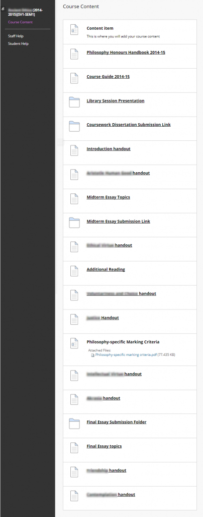
Most pages consisted of a single Content Area. All lecture notes, slides, readings, assessment information, announcements, study skills materials, etc. would be piled there, often in no particular order. And all pages looked completely different, which meant that students who worked out how to find materials in one course would have to work it out again in other courses.
I soon got to the bottom of the problem: nobody likes Learn and nobody feels like putting any work into it. And thus Learn pages are typically messy and difficult to navigate because staff dislike Learn, and staff dislike Learn because it is messy and difficult to navigate.
Unsurprisingly, students weren’t too happy. And thus I decided to reshape the way we use Learn in campus teaching by restructuring course pages to make them less confusing and more user-friendly. My aim was to break the vicious circle by cleaning up and ordering pages across PPLS, thus introducing a sense of order and usability which will make them more approachable for the students and encourage staff to use them in a more structured way.
A silk purse out of a sow’s ear
The work on re-designing the pages had four main elements: de-cluttering by removing non-course specific information; developing a consistent structure applied across PPLS; creating a simple, intuitive and modern-looking navigation tool – the Dashboard; merging doubled MSc/Honours, and sometimes also Visiting Students instances of the same course page (not discussed here). In effect, the pages end up looking as follows:
De-clutter
Most pages contained files duplicated across multiple courses, such as marking criteria or library information. Those were difficult to maintain and often outdated. Together with Nick Daniels I moved the files to a single location – the Student Hub which now contains or links to all non-course specific information such as study skills, mitigating circumstances forms, etc. All Learn pages link to the Hub which hosts mother copies of all such documents. This greatly simplifies the process of updating these documents and removes potential for error.
The Student hub is extremely simple and easy to use. It remains one of our most-used websites, with over 100 average views per day, reaching 1467 views in exam times.
Structure
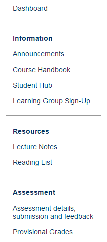 I aimed to create a standard structure applied across PPLS courses, which would be friendly to students, lecturers and admin. It is easy to modify, allowing lecturers to adjust it to the needs of their course while keeping the standard root.
All lecturers were contacted in advance and the modifications were presented as on opt-in proposal which will be sent for their approval. I made it clear that this is not meant as a one-size-fits-all venture, and offered help in adjusting the structure to suit their teaching style. This was received very well and only a very small number of lecturers decided to opt out.
The changes were generally well received, with more than 80% of lecturers who opted in being happy or neutral about them. One comment helpfully identified the root cause of remaining problems:
- The problem is Learn itself, not your valiant efforts to make a silk purse out of a sow’s ear
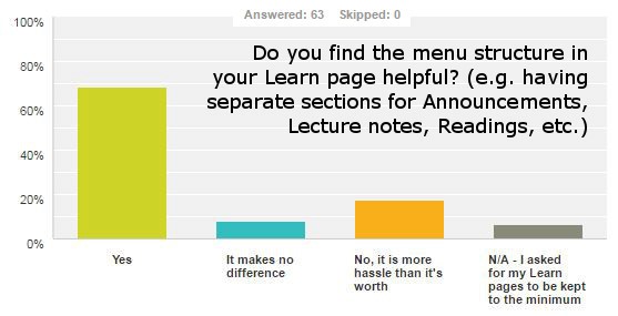
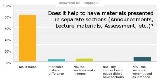
Meanwhile, the students overwhelmingly agreed that having separate sections is useful.
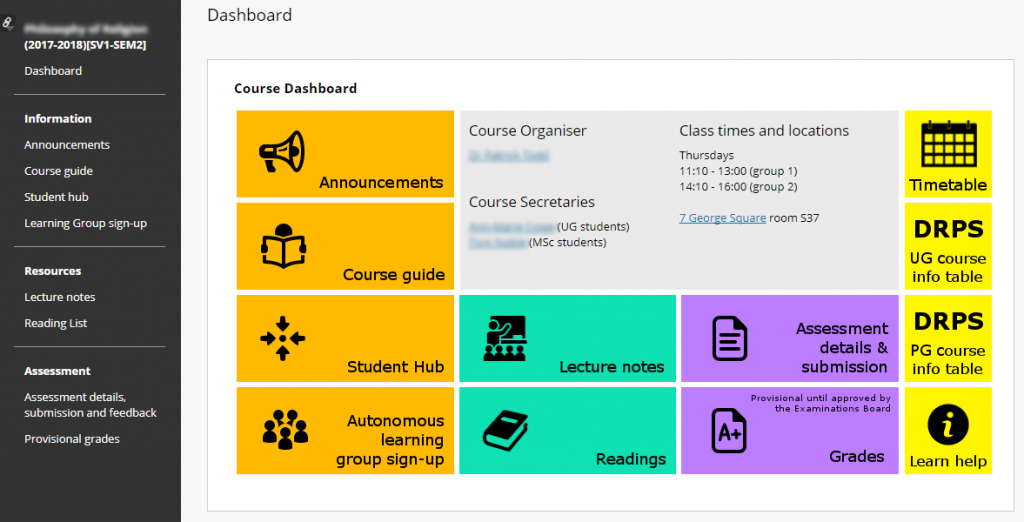
Dashboard
The main aim behind the creation of the dashboard was to simplify and standardise page navigation, thus helping the students find their way around Learn. The dashboards look the same in all courses and contain basic course information (lecture times & locations, contact details), link to Learn help pages, DRPS tables, etc. They bring together useful information and allow the students to get all of it at a glance. Additionally, I hope that they can make Learn look a bit less like it’s the 90’s and help ensure that students don’t perceive us as using outdated technology.
Lecturers can modify the dashboards to suit their course, adding or removing buttons as needed. The editing process has been made as easy as possible and explained in a short ‘How-to’ added below the dashboard itself. This feature is likely the weakest point of the project, as there is no truly easy way to do this in Learn. I aimed to mitigate this issue by offering help to the lecturers.
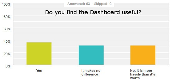 The lecturers’ reception so far is lukewarm, with only slightly more people finding the dashboard useful than finding it a hassle. This is to be expected: the dashboard wasn’t really aimed to be useful to staff – it’s about improving the student experience – and lecturers generally tend to find similar design changes difficult to adjust to at the start. With that in mind, I consider the fact that almost 70% of people did not actively dislike it, to be a success.
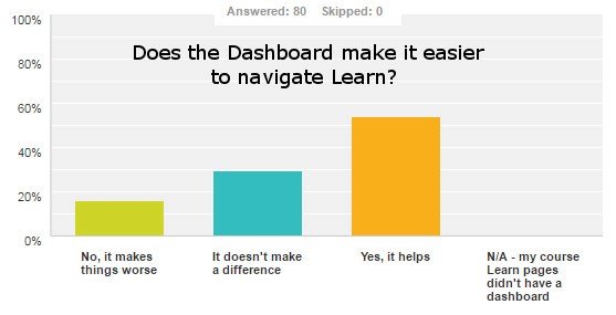
And indeed, the Dashboard was much better received by the students. More than half found it useful, which suggests that it’s a good concept, though it might require some fine-tuning.
So what came out of it?
The surveys suggest that the changes I introduced were a success, with a great majority of staff and students finding them useful. Although a percentage remain dissatisfied, one can hardly expect that everybody will love the ‘sow’s ear’ that is Learn. The project got some further recognition by being shortlisted for last year’s College Recognition Award, informed the current VLE standards project, and gathered some attention from other Schools – some already experimenting with introducing similar templates.
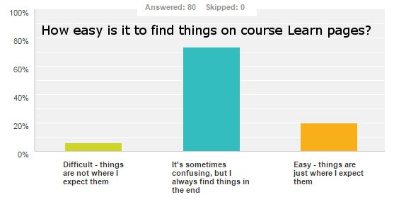
What I find best about all of it, is the fact that following all those changes only 7% of students said that finding things on Learn is difficult. This is a very promising result and I am happy that the changes I introduced contributed to this.
If you like this project, would like to make your Learn pages look and work better, or have suggestions on how to take this further, get in touch! I’ll be happy to help and share the template.
Finally, I’d like to thank the IS Learn team for their help and angelic patience in answering the millions of questions I flooded them with in the process of making this happen, as well as the entire PPLS computing team for their continued support throughout this project. Thank you!
Details of the surveys quoted can be found here and here.

Simon Fokt splits his work between research in philosophical aesthetics and learning technology: the design of online courses and education resources. His academic work focuses on classification of art, aesthetic properties, and the borderlines of aesthetics: pornography, comics and computer games. Being committed to promoting equality in the academia, he manages the Diversity Reading List in Philosophy (@DiversityRead). He is involved in the production and delivery of six MOOCs, including Introduction to Philosophy and Intellectual Humility, as well as the creation of open education resources and promotion of knowledge exchange programmes.